Labels

Sunday, January 21, 2024

Front Cover Development

Here is the development process for my magazine. I will put all of my ideas here and reflect on the decisions that I make. 

Genre: Travel
Sub-genre: Travelling to Bali 

Name of magazine

1. Vintage Voyages: Bali Edition
2. Elders' Escape: Bali Unearthed
3. Retirement Paradise: Bali Unveiled
4. Bali Heritage Horizons
5. Golden year travel 
6. End of age in Paradise
7. Timeless Memories
8. Beautifully Aging in Bali 
9. Timeless Travel 
10. Golden Abiding Escape 

I decided in the title "Vintage Voyages: Bali Edition" for my magazine as the meaning relates with the description of my target audience, which are old people. It sound elegant, classy, and formal which is what elders are typically fond of as back in the days that is the standards they are used to. The use of "vintage" evokes a feeling of timeless and sophistication, reflecting to the interests and preferences of many elders who appreciate the values and standards of past eras. 

Possible Coverlines 
1. Savoring Bali's Culinary Delights: A Taste of Paradise
2. Golden Years, Golden Sands: Bali's Ageless Allure
3. Heritage, History, and Harmony: Your Bali Dream Vacation
4. Wellness and Serenity in Bali: Your Ultimate Retreat
5. Bali's History: Crafted with Love and Tradition 
6. The Beauty of Bali's Seaside: A Guide to Senior Relaxation
7. Bali's Nature Calls: Where the Grass meets the Sands 
8. Exploring Bali: A Senior's Handbook to the Island of Gods
9. Grass, Sands, and Stones: Bali's Senior-Friendly Itinerary
10. Bali's Delicious Delights: A Taste into the Island of Gods

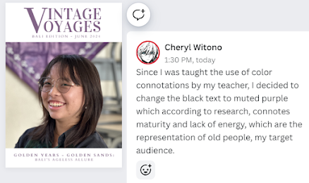
I want to choose this for my main coverline because it's a fun play of words that aligns with the age of my target audience, which are old people in hopes to make their senior age appear more beautiful and pleasing and less of a bad thing. The word "golden" may also attract them as according to research, it means accomplishment throughout history which relates to their journey in succeeding to live a long life. Furthermore, after researching, the phrase "golden years" implies a period of fulfillment, happiness which are feelings that I hope my target audience can have in mind when they think about Bali and therefore, are persuaded to go to Bali. 

Images (min. 4)
1. Long shot of sanur beach 
2. Medium/long shot of 2 or more elderlies enjoying their time in the beach where they would be laying down on the sun beds chatting/laughing happily together. The second option is a medium shot of them laughing/chatting happily when eating together in one of the cafes in the beach.
3. Long shot of kuta beach 
4. Close up shots of Bali's traditional foods and seafood in the beach 
5. Long shot and close up shots of Puri Lukisan Museum

The ideas that I have for my main cover image are firstly a medium/long shot of 2 or more elderlies enjoying their time in the beach where they would be laying down on the sun beds chatting/laughing happily together. The second option is a medium shot of them laughing/chatting happily when eating together in one of the cafes in the beach. The elderlies happily chatting/laughing will be the main attraction of the image as I want it to be a reflection of how my target audience will be if they do come to Bali after reading my magazine. Furthermore, I hope for it to give off a sense of positivity and warmth towards people who sees it, preferably my target audience, and make them want to pick it up with the reason that they would like to be like that too. This idea conforms to the conventions of travel magazines where some typically includes people in it, whether it'd be tourists or locals. Also, this will be quite easy as Bali is full of foreign tourists including my targeted age range. Not only that, I go to either Sanur or Kuta Beach once every week, therefore It won't be a hassle for me. 

Reflection
In the making of this task, I found it really fun as I was able to explore creative words, meaningful idioms, and play of words that helped to make unique and attractive ideas of names of the magazine and main coverlines. Not only that, my teacher allowed me to create 5 of the 10 ideas for each section from Chat GPT which made the process easier as I had a foundation to the ideas of what i want the name of my magazine to be and the coverlines I want to display. It also made it less complicated for me to the rest 5 on my own. I laid the exact names of the name and coverline, therefore in the making of my magazine, I can just go back here and copy paste from the idea I chose. Not only that, because I had to make 10 ideas, in the case where I start not liking the one I chose, I can also choose another one from the list of ideas I gathered. Because of these reasons and since i did this prior to the making of my magazine, It will be less time-consuming during the time I have to make the actual magazine as there is the absence of having to brainstorm those ideas in the time when I should be prioritizing putting everything else together such as the images and the article. 

Below are my research and preparations my teacher told me to do in order to make the development of the front cover smoother as I'll already have the ideas planned out. 

My teacher told me to lay down 4 of my thumbnail sketches, choose 2 and develop digitally with the sample photos I took at school, choose one of them and experiment a lot, make evidences on all the changes I made, and add comments on what I like and what I think I can improve next to or under the sketches. 

Thumbnail Sketches
Here are the 4 thumbnail sketches I chose:


Here are the 2 thumbnail sketches that I chose to develop digitally with sample photos I took at school:


Experiment and Development
This is the process of me developing them digitally:


I chose the 1st sketch and sample photo to experiment a lot on and these are the results:


Research
I researched multiple minimalistic travel magazines in Google and Pinterest to find their genre conventions and similarities in order to gain ideas for my own front cover magazine page as I plan to follow their genre conventions. These are the result of my research. 


After looking at a number of minimalistic travel magazines such as the ones above, here are the things that I noticed: 

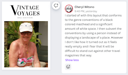
1. During my research, I noticed that almost all minimalistic travel magazines have a certain noticeable amount of whitespace (I mistake white space with negative space beforehand) and I figured that it contributes to achieving a clean and simple look. My magazine will therefore also conform to this genre convention since the presence of white space has already become a stereotype of minimalistic magazines as well. 

2. Secondly, I noticed that most of their typefaces are simple bolded fonts such as San Serif or Vidaloka that gives off a sharp strong look. There are no italics, outlines, and other typefaces present to preserve the neat and clean look. 
 
3. Not only that, the color of the masthead are usually in black as it stands out strongly especially against the white background compared to other neutral colors that may be used to match with the image more. However I will subvert to this convention as when I experiment using black compared to neutral colors that matches with the image, the neutral colors looks more pleasant to the eye. 

4. There is nothing overlapping the main image such as coverlines where they're all placed out of it to give readers a full picture of the main image that is not disturbed by any text. This results in a cleaner look instead of things clashing against each other and making it look crowded.

5. The producers really often displays certain destination or landscapes as their main image as it also gives an idea towards the readers of the contents of the magazine. This then has become a stereotype that allows the readers to notice right away that its a travel magazine. Though, I will subvert to this convention as my main image is a person instead of an image of a place, with the objective to stand out against other travel magazines. 

Final Development
After planning and researching, I will now start on developing my final front cover. Here are my front cover development process. 


Here's a canva link as the image is unclear: 
https://www.canva.com/design/DAF7_fyYX8A/Cg6LDUhRb7VQLAZ6z0K7Pg/edit?utm_content=DAF7_fyYX8A&utm_campaign=designshare&utm_medium=link2&utm_source=sharebutton

Self-Reflection 
I started my entire research and development for my magazine with this front cover development, therefore it was quite overwhelming to do as during the development process, I was just taught about the use of borders, hierarchy of type, type faces, and colors and in the process of getting used to taking all of them into account when making numerous development draft. Because in some cases, I was just constantly improving or changing a few things in certain versions of the drafts, even though it was quite fun at first to see my ideas come together, the repetitiveness made me loose motivation to continue at one point. My teacher then advised me to take a short break to clear my mind first rather than continuing it and seeing it as a burden instead of enjoying the process and during my short break, I looked around to see my friends that have similar genre conventions in which this helped me in receiving ideas on how to improve the drafts I made. 

Wednesday, January 17, 2024

Magazine Layout Tutorial

In this post, I will demonstrate some basic design skills that I learned in class. 

I started by sketching ideas for my front cover. I didn't like the result in this because I'm not good at drawing, but I discovered the drawings don't need to be in detailed, therefore I feel like my sketch results turned out pretty alright. 


Then my teacher told me to experiment with some default layouts he provided for the class. I started off very bad as this is the first time I've actually started making a front cover, even if it's just an experiment. 


Next, my teacher taught the class about the use of borders, hierarchy of type, type faces, and colors. He taught us that using border can help organize the contents in the front cover as I can structure all of them according to the border line, therefore they're all following the same ruler. This makes the layout look neater and gives the readers an impression of a professional magazine. Hierarchy of type in the case of bolding the masthead and making it a bigger size than the coverlines may help catch the reader's attention directly to know what the magazine's about or its main content. Typefaces and their colors may help in conveying the genre of the magazine as different colors connote different meanings such as yellow connotes summer and certain fonts may connote different vibes such as playfulness or minimalistic. This also gives a general idea towards what the magazine will convey in its contents. 

This is the result of my experiments after my teacher taught me about those 4 factors and after I made a few changes according to what he introduced to me: 


Reflection
I learned about the effects border, hierarchy of type, type faces, and colors have on readers. This helped me remember when my teacher told me that everything in media has to have meanings whether it'd be implicitly or explicitly. Because of this experiment, I'm introduced an easier way to structure the contents of my front cover neatly that I will use in my actual magazine and I will be more careful in choosing the type faces and colors I'll use as it also has to match with my genre conventions. At first, I thought using Google Draw is easy and I considered using it for my actual magazine, however I found limitations, one being that I can't add pages to it therefore I can't track my progress whenever I change things. Because of this, I'll use Canva as my software as I can use borders and rulers, duplicate my pages, and add pages as well. 

Location Scout and Risk Assessment

In this blogpost, I will do a risk assessment of my photoshoot locations.

Location 1 (Sanur Beach)


Location: Sanur Beach 

Google map link: https://maps.app.goo.gl/9Jys1gwcxRBw9F9Q7

Purpose of the shoot: A long shot of 2 elderly people laying down in a beach bed to give the readers an idea of how relaxing and peaceful Sanur Beach is. 

Media Language:

- Long shot of 2 elderly people laying down in a beach bed 

-> Props (definite): Beach bed

-> Props (possible): Books, sunglasses, refreshing drinks 

-> Costume: Swimming trunks 

- Long shots of the silhouettes of mountains to give an idea to what they may see while they are laying down. 

- Lighting: Natural lighting 

- Focus lens: On the 2 elderly people 

Pros of the Location:

- It is a tourist destination for any age range, therefore it wouldn’t be difficult to come across elderly people relaxing in one of the beach beds. In addition to that, this will make it more realistic as it won’t seem like they are hired actors. 

- It is well known for its sceneries such as mountain silhouettes, vibrant seashore color, and clean beaches therefore, these elements can be used to attract the readers more, especially ones who really enjoy nature elements. 

- Since it’s an open and really wide area, It’s unlikely that there are crowds of people everywhere that may disturb the photography process. 

Cons of the Location:

- There are chances where it may suddenly rain or the weather turns gloomy, therefore it won’t be a suitable condition to take photos due to bad lighting and equipment that are not allowed to be in contact with liquid 

- Since the beach bed is out in the open, the material might look worn out and have little stains. This will make the image look less appealing and gives an impression to the readers that it’s dirty and not taken care of. 

Alternative Location: Petitenget Beach, Seminyak Bali 

Google map link: https://maps.app.goo.gl/PHwkJi9Z1afaGed66

Risk Assessment 

Potential Hazards

- Sudden rain or strong wind 

- Increase in tide levels 

Evaluate Risks:

- The sudden rain or strong winds can make my potential models reluctant to spend time on the beach and it may also make their hair untidy due to the wind continuously gushing through them. Not only that, my camera may be damaged if it comes in contact with raindrops or bits of sand flying to it. 

- When shooting, there are possibilities when the water level may suddenly rise. This will disable my option of taking photos of 2 elderly people walking together near the sea shore as we all may be caught off-guard and possibly fall due to the heavy push by the tides, thus my camera may also fall and break due to being in contact with water. 

Control Measures and Implementation Timeframe:

- Check BMKG (Badan Meteorologi, Klimatologi, dan Geofisika - an app that tracks natural occurrences in Indonesia) for rain and wind level predictions as well as the tide level on the 19th of January and the morning of 20th of January. 

- Buy and use waterproof coverage for my camera to avoid cases where tiny water droplets carried by the wind get in contact with the camera lenses or if I accidentally fall into the water after getting pushed by the waves. (13 January)


Location 2 (Kuta Beach)

Location: Kuta Beach 

Google map link: https://maps.app.goo.gl/sfFwo9NhfoS8NJ6a6

Purpose of the shoot: To promote a more lively side of Bali’s beaches in comparison to the calm and peaceful Sanur Beach as compared to Sanur Beach, Kuta has way more local stores placed all throughout the side of the pathway where people walk and offers a wider range of activities such as shopping, cultural performances, sunset spotting, and Balinese massage. 

Media Language

- Mise-en-scene:

-> Props (definite): Beach vendors, beach beds, beach umbrellas, and bean bags 

-> Props (possible): Little lanterns near the beach beds or bean bags if the shooting time is near sunset or during sunset. 

-> Costume: Swimming trunks 

-> Lighting: Natural lighting in addition to the light coming from the little lanterns when

shot during sunset. 

-> Some shots would have the focus lens on the sellers of the beach vendors

- Long shots of the beach beds and bean bags 

- Medium or close-up shots of sellers of the beach vendors working 

- Long shot of cultural performances (tentative) 

- Close-up shots of customers doing the Balinese Massage

Pros of the Location:

- Numerous local vendors I can take candid pictures of to put in my magazine to show how lively it is. 

- A wide range of activities to choose from to display in my magazine e.g. Balinese massage, hair beading, to simply drinking coconut water on one of the beach beds. 

- Can take sunset shots as Kuta Beach is in the southern west coast of Bali 

Cons of the Location:

- In the case where I shoot during sunset hours, it may be really crowded and make it difficult to take focus shots on specifically elderly people with the possibilities of people blocking the camera and even bumping into me. 

- For Kuta Beach, the sunset is what I am using as one of my main attractions however it is unpredictable on whether or not the day I’m shooting will have a good sunset hue. 

Alternative Location: Jimbaran Beach 

Google map link: https://maps.app.goo.gl/8ksthAsS9ANDrdWL6

Risk Assessment 

Potential Hazards:

- Sudden rain 

- Strong wind 

Evaluate Risks:

- The sudden rain may damage my camera lens as it cannot come in contact with any type of liquid. I will also have to go somewhere indoors until the rain stops and in the case where it doesn’t stop, I have to do the shoot another day and there are possibilities where the sunset hue may not be that good. 

- Not only that, the strong winds may make it hard for me to balance the camera and may result in tilted images and blurry results. Bits of sands and water droplets can also be carried by the strong winds and stick to my camera lens, making the results unclear and some covered by small patches. 

Control Measures and Implementation Timeframe:

- Check BMKG (Badan Meteorologi, Klimatologi, dan Geofisika - an app that tracks natural occurrences in Indonesia) for rain and wind level predictions on the 26th of January and morning of 27th of January. 

- Buy and use waterproof coverage for my camera to avoid cases where tiny water droplets carried by the wind get in contact with the camera lenses or if I accidentally fall into the water after getting pushed by the waves. (13 January)

Self-Reflection:

This location scout and risk assessment helped me be more aware of the risks available at the locations I have chosen that I didn’t think about before which would’ve been dangerous as I’m carrying costly equipment and using real life people as models. It also helped me be more prepared in case the worst case scenarios happen as I have already researched about the control measures and their implementation timeframe I will use, therefore I won’t be panicked and handle the situation incorrectly when those worse case scenarios do happen. However, since this is the first assignment I did after I came back from a one month semester break, I had trouble recalling the mise-en-scene, however thankfully I had them all written in my notes in which rereading it really helped me remember them better not only for this assessment but in the making of the magazine as well as I remembered my teacher telling me that all the designs that I chose has to have meaning according to the media theories and terms I previously learned.